Authenticx
Data-Backed Storytelling: Effective Story Visualization
June 23, 2025 by Sally Perkins
Copied link
Visuals can make—or break—your data-backed story. While a well-crafted narrative engages hearts and minds, cluttered or misaligned visuals can derail that connection in seconds. To truly move an audience, effective story visualization means your story and visuals must work together, not compete. From strategic use of color and font to guiding animations and clean transitions, how you visualize your story can determine whether your data simply informs or truly inspires. In this post, we’ll explore expert tips to ensure your slides elevate your narrative and keep your audience locked in from start to finish.
Read the following Data-Backed Storytelling Tips to learn more about effective visualization of stories.
Think of your visuals as dangerous sources of competition.
A strategically designed data-backed story can be ruined in an instant with visuals that are not strategically designed in equal measure.
Any time you put a visual in front of an audience, you give them a choice: pay attention to what you’re saying OR read what they see on the screen. So, you would be wise to think of your visuals as sources of competition to your storytelling.
An effective storyteller aims to design visuals in a manner that complements the narrative rather than competes with it. By complementing the narrative, they make vivid the story being told. In fact, complementary visuals accomplish three purposes:
- They serve as a short-cut to a long-winded explanation of a series of data points, enabling the viewer to understand and interpret the data within seconds. Even photo and icon images can quickly make the key points of a story “click” with an audience.
- They help control how a meaning is created in the minds of the audience. By deploying both oral and visual cues, the storyteller stands a better chance of ensuring that the meaning they wish to convey is close to the meaning each audience member builds in their own minds.
- They make the story more memorable because of the activation of visual cortices in the brain.
Consider the following techniques for designing visuals that complement rather than compete with a story.
Less is more: Scrub the distractions from your data and story visualizations.
‘One way to manage the competition that visuals create is to abide by the principle that “less is more.” The less one sees on a slide, the more likely they are to process what they see alongside what you are saying and the easier it is for the audience to interpret what they are seeing.
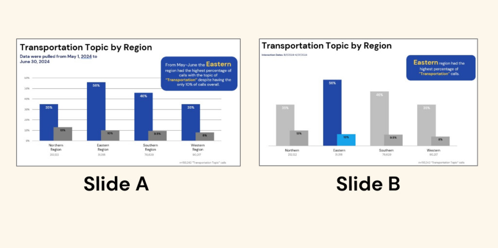
“Less is more” may mean simplifying a graph, eliminating unnecessary graph lines, eliminating unnecessary details along the X and Y axes, if possible, and limiting the number of graphs on a single slide. Notice how Slide B draws your eye to the story better than Slide A.
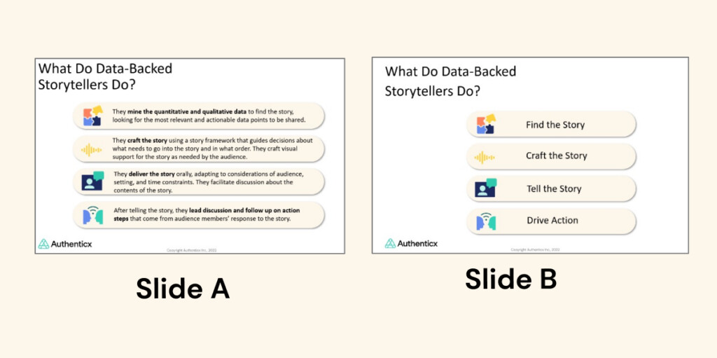
Less is more” may also mean eliminating verbose bullet points. If bullet points are necessary, include only the key words and let your talking points do the rest. Compare Slides A and B below.
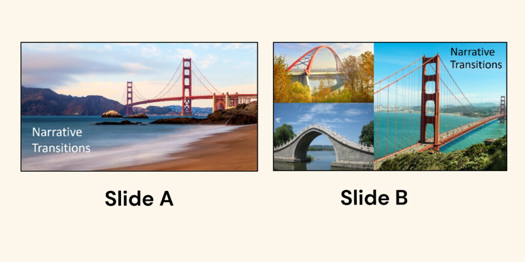
“Less is more” may mean eliminating multiple and busy photo images. A single, clean image goes a long way to help tell a story, while busy photos and multiple photos are too much for the human brain to process in any meaningful way. Notice how much easier it is for your eye to digest the visual metaphor on Slide B below.
“But,” you say, “what if my deck will get shared outside my presentation? Those viewers need more details because they won’t hear my narrative. The deck needs to be able to stand on its own without me.”
Fair point.
So, you have two options: 1.) You can create two versions of the deck: one version for your presentation and a second version with more details and explanations for your readers. 2.) If you must use the same deck, be sure to build in ample animations so that the details on the slide never overwhelm the audience and the audience isn’t able to get ahead of you in your storytelling.
Challenge: The next time you prepare a data-backed storytelling deck, challenge yourself to take just one slide and strip it of as much as you possibly can and see the difference!
Tell the story with strategic colors and FONTS.
Remember when you were in middle school and you had to create posters for a presentation or signs to advertise your club call-out meeting? It was fun to use 10 different colors for all the letters in the words.
“Join the ANIME CLUB tomorrow!”
You had a good intuition that color could be useful to get attention, but it must be used judiciously.
A short phrase can offer a narration of the key idea in a graph, and the use of a different color and/or font can draw the viewers’ attention to key words or numbers. Similarly, you can use color on a graph to highlight what is important for the audience to soak in. Using gray for the parts of the graph less relevant to your story can make it easy for your audience to track the connection between your oral narrative and what they are seeing. (Take another look at the graphs shared above).
In Slide B, since the story is about the Eastern region, the storyteller draws the viewer’s eye to the Eastern region data point, making it easy for the viewer to process the prevalence point being made.
One other general rule of thumb about color: Typically, you should use no more than three colors per slide to help the audience focus visually in a way that complements your story.
Control the narrative through animations and story visualization.
Recall the last time you were engrossed in a novel or a movie. As you read or watched, you forgot about other things in your life because you were so eager to know how the plot would unfold. You might have been guessing “who done it” or “how the romance might turn out,” but you were willfully following along, waiting for the next piece of the story. And what kept you following along was the fact that you only had small bits of information at a time, which is, in fact, what makes a story a story: the gradual revealing of information and events that take the audience through a character’s journey through a problem. When well executed, the audience is comfortably and confidently led by the storyteller through the journey, anticipating what’s coming next in the story but is never too far ahead of the storyteller.
So too, when we tell a data-backed story we want the audience to feel comfortable being led through the journey. Unfortunately, when a storyteller shares a visual containing several different elements all at the same time, some audience members will stop listening to the storyteller (because no one is actually capable of cognitive multi-tasking) and instead start interpreting data that is two or three steps ahead of the narrative. Consequently, the storyteller is wasting their breath as they continue to talk, making important story points that the audience member is missing.
Two ways to keep the audience at the same place you, the storyteller, are in the story are to either use animations or to use multiple slides that build upon one another.
Animations: Some people dislike the idea of animations. To be clear, we’re not talking about animations that fly in, twirl in, or zoom around three times. We’re talking about clean animations that allow a new piece of information to appear on the screen as the storyteller describes it. Because humans are incapable of fully listening to a speaker while reading, animations are the storyteller’s best option for ensuring that the meaning being received is as approximate as possible to the meaning being sent.
Slide Builds: If animations seem difficult, an alternative is to use multiple slides that build on one another, each slide adding a new component for the audience to focus on. In fact, when multiple slides are used, it can be helpful to show important information in color initially, then gray it out on the next slide and add color to the new component coming in.
Knowing that when a story is well-told, the audience rides right with the storyteller, we’re curious if you have other visual strategies for keeping the audience with you.
Build slides that reinforce the narrative transitions.
What’s crystal clear in your mind is NOT crystal clear in your audience’s mind.
One of the greatest challenges that storytellers face is getting out of the clear vision of their story in their mind and getting into the fuzzy vision of their story in their audience’s mind, but doing so helps the storyteller know what needs to be made more explicit.
Narrative transitions hold a story together by logically connecting the different parts. Not only should a storyteller prepare their narrative transitions, they may also want to build visuals that support the narrative transitions, keeping the audience on the narrative journey.
Simple slides with a few transitional words or phrases can effectively keep the audience in lockstep with the storyteller. In the four example slides below, notice that the language doesn’t just label a topic shift. Instead the language contains narrative cues that set the audience up for what is coming next in the story.
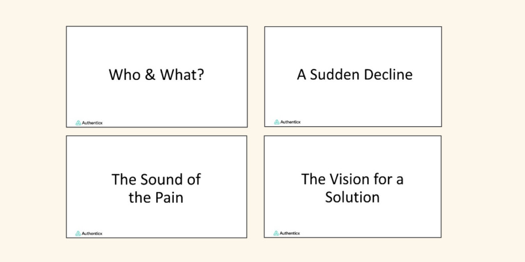
Building transition slides are a simple yet effective way to ensure that your data-backed story doesn’t slip into a data-dumping session!
CHALLENGE: The next time you build a presentation deck, try making transition slides that don’t just label a topic change, but contain words that indicate story progression.
Wrapping Up: Turning Data Into a Story That Drives Change
Data storytelling isn’t just about numbers or charts, it’s about connecting the dots in a way that drives understanding, action, and impact. Throughout this series, we’ve explored the strategies that transform raw data into meaningful narratives: from highlighting real customer journeys to surfacing hidden trends that impact business outcomes.
At Authenticx, we believe that the most powerful stories are already being told—they’re just waiting to be heard. Our healthcare-specific AI is built to listen, interpret, and illuminate the insights that matter most from your everyday customer interactions. Whether it’s spotting early signs of friction or amplifying what’s working well, Authenticx helps you harness your data to improve experiences, reduce risk, and drive performance.
Ready to take your data storytelling to the next level? Learn more about how Authenticx helps healthcare organizations elevate their narrative or let’s find time to book a demo to see our platform in action.
Catch up with this data-storytelling blog series:
- Blog #1: The Human Brain Needs Data-Backed Stories
- Blog #2: How Data Can Inspire
- Blog #3: The Strategic Data-Backed Story Set-Up
- Blog #4: The Strategic Data-Backed Story Ending
- Blog #5: Effective Use of Micro Stories
- Blog #6: Effective Telling of Stories
About Sally Perkins
Dr. Sally Perkins serves as Sr. Manager of Storytellers at Authenticx. She analyzes quantitative and qualitative conversational data from which she crafts impactful data-backed stories that offer insights into how professionals across industries, such as healthcare, can improve the customer experience and their business outcomes.

About Authenticx
Authenticx was founded to analyze and activate customer interaction data at scale. Why? We wanted to reveal transformational opportunities in healthcare. We are on a mission to help humans understand humans. With a combined 100+ years of leadership experience in pharma, payer, and healthcare organizations, we know first-hand the challenges and opportunities that our clients face because we’ve been in your shoes. In 2023, Authenticx was ranked No. 349 on the Inc. 5000 recognized as one of America and Indiana’s fastest-growing private companies.
Want to learn more? Contact us!
Or connect with us on social! LinkedIn | Facebook | Instagram | YouTube | Twitter/X