Customer Insights
How To Analyze Customer Satisfaction Survey Data
October 15, 2026 by Molly Connor
Copied link
Customer satisfaction survey analysis is critical to improving performance and building lasting relationships with the people you serve. In healthcare, those people are members, patients, and caregivers, and the surveys that measure their experience carry regulatory and financial weight that generic CX advice rarely accounts for. This guide is written for healthcare organizations specifically: payers, providers, pharmaceutical companies, and medical device manufacturers.
For health plans, the customer satisfaction survey that matters most is CAHPS, the Consumer Assessment of Healthcare Providers and Systems. For health systems, it’s HCAHPS, the hospital version of the same survey family. Life sciences and med device teams run their own patient and HCP satisfaction programs alongside hub and support services. The methods below apply to all of them.
We’ll cover the quantitative methods for analyzing scores, the qualitative methods for making sense of open-ended comments, a worked healthcare example, and the tools, both manual and AI-powered, that teams use to do this analysis at scale.
Why Customer Satisfaction Survey Analysis Matters in Healthcare
For Medicare Advantage and Part D plans, member satisfaction survey data is CAHPS, and it feeds directly into CMS Star Ratings. CMS cut the weight of patient experience and complaint measures in half beginning with the 2026 Star Ratings, but those measures still count. When a small shift in a plan’s rating can decide whether it earns quality bonus payments, every measure matters. For hospitals, HCAHPS scores are publicly reported and tied to reimbursement through Medicare’s Hospital Value-Based Purchasing program, so a declining trend puts patient experience leadership under pressure fast.
The core challenge is timing. CAHPS results for Medicare plans are collected once a year and arrive months after the experiences they describe. HCAHPS results are publicly reported on a lag. Friction happens all the time, with members calling about denied claims every day and patients struggling with scheduling and billing every week. When survey data arrives this infrequently, customer satisfaction survey analysis has to extract every possible insight from each response.
Quantitative Methods for Analyzing CSAT Survey Data
Quantitative analysis turns numerical ratings into something you can track, compare, and act on. The same methods that power generic CSAT (Customer Satisfaction Score) survey analysis apply directly to CAHPS and HCAHPS composite scores, such as getting needed care, customer service, or communication with nurses.
Calculating CSAT
CSAT is the standard metric for most satisfaction surveys. Respondents rate an interaction or experience, usually on a 1 to 5 scale, and CSAT is the percentage who chose one of the top two ratings:
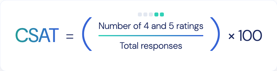
If 180 of 240 members rate their call a 4 or 5, CSAT is 75%. This “top-box” approach mirrors how HCAHPS results are publicly reported, as the share of patients giving the most favorable response, which makes CSAT analysis a natural bridge between internal surveys and the regulatory scores leadership watches.
Descriptive Statistics
Descriptive statistics give you a quick read on your data by showing where scores cluster (mean, median, mode) and how spread out they are (range, standard deviation). A mean score of 4.1 with a tight spread tells a different story than a 4.1 built from a mix of 5s and 1s. The second pattern often signals a subgroup having a very different experience.
Inferential Statistics
Inferential statistics let you generalize from a sample to your full population and test whether differences are real. Hypothesis testing, such as t-tests and chi-square tests, answers questions like whether a three-point CSAT drop after a benefits change is meaningful or just noise. That matters in healthcare, where survey samples are often small relative to the member or patient population.
Regression Analysis
Regression analysis identifies relationships between survey variables and outcomes. A health plan might regress its overall plan rating against ratings for customer service, claims processing, and ease of getting care to see which driver moves the overall score most. Correlation is the simpler starting point; regression shows how much each variable contributes while controlling for the others.
Cross-Tabulation and Cluster Analysis
Surveys often include multi-response questions or demographic fields. Cross-tabulation compares responses across segments, such as member or patient type, service line, channel (phone, chat, portal), or reason for contact. Cluster analysis goes a step further, grouping respondents with similar response patterns so you can see, for example, that recently enrolled members rate nearly everything lower. Both are core to survey data analysis because averages hide the segments that need the most attention.
Qualitative Methods for Analyzing Open-Ended Survey Responses
A low CAHPS or HCAHPS score tells you something went wrong. The comment field tells you what went wrong and why. Customer feedback analysis of open-ended responses is where teams find root causes, and in healthcare those root causes often involve prior authorizations, claim denials, scheduling access, or billing confusion that a numeric rating can’t describe.
Three methods do most of the work:
• Content analysis categorizes and quantifies comments. You build a coding scheme (billing, wait times, staff courtesy, care coordination) and count how often each code appears, turning text into data you can trend over time.
• Thematic analysis identifies patterns of meaning across responses. Where content analysis counts mentions of “billing,” thematic analysis might reveal that the real theme is patients not understanding what they owe before a procedure.
• Grounded theory builds explanations from the data up rather than testing a hypothesis you started with. It’s useful when scores drop and nobody knows why yet.
Pay close attention to repetition. When the same complaint shows up across many respondents, or the same member or patient submits low scores again and again, you’re looking at recurring friction rather than isolated bad experiences. Authenticx calls this pattern the Eddy Effect: people caught in a loop of unresolved problems that keeps pulling them back into contact.
Good qualitative analysis also needs discipline. Define your codes before you start, have a second reviewer code a sample to check consistency, and save representative comments for each theme so stakeholders hear members’ and patients’ actual words, not just a category label.
Survey Data Analysis Example
Here’s how quantitative and qualitative methods combine in practice. Imagine a health plan’s member services line sends a short post-call survey. Ten members respond with a 1 to 5 rating and a comment:
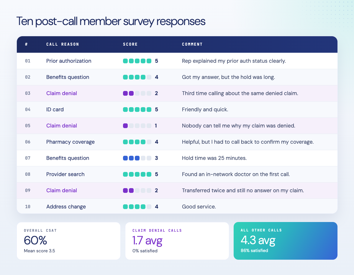 1. Score it. Six of ten members gave a 4 or 5, so CSAT is 60%. The mean score is 3.5.
2. Segment it. Cross-tabulating by call reason exposes the gap. The three claim denial calls averaged 1.7, with zero satisfied respondents. The other seven calls averaged 4.3, with 86% satisfied.
3. Theme it. Coding the comments surfaces three themes: unclear claim denial explanations (three comments), long hold times (two), and repeat calls about the same issue (two).
4. Conclude. A 60% CSAT isn’t a service-wide problem. It’s a claims communication problem. Agents are fielding denial questions without the information or language to explain them, and members are calling back as a result. The fix is targeted: better denial-reason visibility for agents, a consistent explanation framework, and coaching on those calls, rather than a blanket push to “improve service.”
Survey Data Analysis Software
The right tool depends on survey volume and question type. Manual tools handle small volumes and structured questions well. They break down on open-ended comments at scale, which is where most of the real insight lives. It’s also the blind spot for most healthcare organizations, where thousands of comments go unread because no one has time to code them.
Manual Tools
Microsoft Excel is an accessible starting point. PivotTables summarize scores by segment and support cross-tabulation, and functions like COUNTIF can tally keyword mentions to approximate content analysis. Google Sheets offers similar functions plus real-time collaboration, which helps when quality, operations, and patient experience teams review the same data. Both work well for a few hundred responses. Beyond that, manual coding becomes slow, inconsistent between reviewers, and hard to repeat every survey cycle.
AI-Powered Analysis with Authenticx
When survey volume outgrows manual review, or when you need to connect survey scores to what actually happened in the conversations behind them, AI-powered analysis fills the gap. Authenticx is built exclusively for healthcare, with models trained on healthcare conversations.
Survey and CSAT reporting lives in Business Insights, alongside trends in contact volume, complaint themes, and repeat-contact patterns. The survey shows that members or patients were dissatisfied, and the underlying calls, chats, and emails show what they experienced.
KBo, Authenticx’s AI assistant, lets teams ask questions of their conversation data in plain language instead of building manual reports. A member experience leader can ask what’s driving repeat calls this month, or how often patients express frustration about billing, and get an answer in seconds. KBo surfaces the same kinds of sentiment and theme patterns across calls, chats, and emails that a survey verbatim would reveal, but continuously and across every interaction rather than a small periodic sample. For patient satisfaction survey analysis, that means you don’t have to wait for the next CAHPS or HCAHPS cycle to learn what’s driving your scores.
The first question healthcare leaders ask about AI-summarized survey insights and conversation themes is whether they can trust them. Authenticx pairs its models with on-shore, human-reviewed AI, so the themes that rise to the surface are validated by people who understand clinical nuance, regulatory context, and how members and patients actually talk.
See What’s in Your Survey Data
A satisfaction score tells you how people felt. It doesn’t tell you why. Authenticx helps healthcare teams close that gap by connecting survey results to the conversations behind them.